You are viewing an old version of this page. View the current version.

Compare with Current View Page History

« Previous Version 3 Next »


Objectives


  • Set-Up a cartesian projection
  • Learn how to pass  arrays as input of curves
  • Learn how to use CSV files as input of curves
  • Add a text.
  • Create a layout

You will need to download


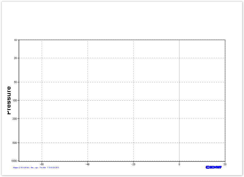
Profile: create the Cartesian Projection

For our vertical profile, we will need :

  • a horizontal regular axis for a temperature range going from -60oC to 20oC.
  • a vertical logarithmic axis going from 1020 hPa to 10 hPa

Have a look at the Subpage Documentation and at the Axis Plotting Documentation, and try to get the 0oC grid line highlighted.

Parameters to check


Useful projection parameters

subpage_map_projection

subpage_x_axis_type
subpage_y_axis_type
subpage_x_min
subpage_y_min
subpage_x_max
subpage_y_max
Useful axis parameters
axis_orientation
axis_type
axis_grid

axis_grid_reference

axis_title
Python - Adding New-York City
# importing Magics module
from Magics.macro import *
# define the output
output = output(output_formats=['png'],
        output_name_first_page_number='off',
        output_name="profile_step1")
projection = mmap(
    subpage_map_projection='cartesian',
    subpage_x_axis_type='regular',
    subpage_y_axis_type='logarithmic',   
    subpage_x_min=-70.,
    subpage_x_max=20.,
    subpage_y_min=1020.,
    subpage_y_max=10.,)
#define the vertical axis
vertical = maxis(
    axis_orientation='vertical',
    axis_grid='on',
    axis_type='logarithmic',
    axis_tick_label_height=0.4,
    axis_tick_label_colour='charcoal',
    axis_grid_colour='charcoal',
    axis_grid_line_style='dash',
    axis_title='on',
    axis_title_text='Pressure',
    axis_title_font='arial',
    axis_title_font_style='bold',
    axis_title_height=1.,
    )
# define the horizontal axis
horizontal = maxis(
    axis_orientation='horizontal',
    axis_type='regular',
    axis_tick_label_height=0.4,
    axis_tick_label_colour='charcoal',
    axis_grid='on',
    axis_grid_colour='charcoal',
    axis_grid_thickness=1,
    axis_grid_reference_level=0.,
    axis_grid_reference_line_style='solid',
    axis_grid_reference_thickness=1,
    axis_grid_line_style='dash',)
    
plot(output, projection, vertical, horizontal)


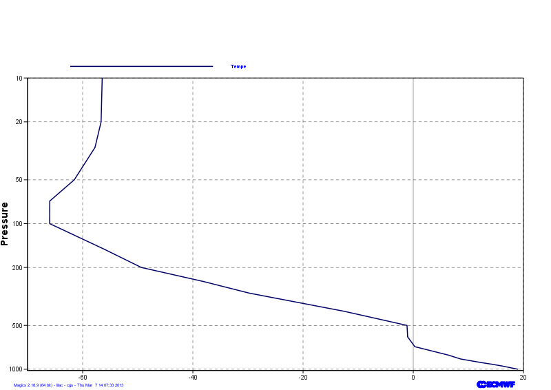
Profile: Using Arrays as Input of a Graph

Here is the list of levels, and the list of Temperature in Kelvin at each levels.

levels = [1.,2.,3,5,7,10,20,30,50,70,100,150,200,250,300,400,500,600,700,800,850,900,925,950,1000]
kelvin = ([263.118652344,254.822738647,242.517868042,223.301025391,219.254943848,216.710174561,216.507095337, 215.398986816,211.643295288,207.18812561,207.172134399,217.097396851,223.809326172,235.13168335,243.377059937,260.635147095,272.02935791,272.145584106,273.448501587,279.562927246,281.745040894,285.503082275,287.543685913,289.284072876,292.170974731]

We can pass these arrays to Magics using the minput object . Check the Input Data Documentation for more information about the parameters.

The mgraph object can then be used to  preform the visualisation. All the parameters can be found in the Graph Plotting Page.

Parameters to check


Useful projection parameters

subpage_map_projection

subpage_x_axis_type
subpage_y_axis_type
subpage_x_min
subpage_y_min
subpage_x_max
subpage_y_max
Useful axis parameters
axis_orientation
axis_type
axis_grid

axis_grid_reference

axis_title
Python - Adding New-York City
# importing Magics module
from Magics.macro import *
# define the output
output = output(output_formats=['png'],
        output_name_first_page_number='off',
        output_name="profile_step2")
projection = mmap(
    subpage_map_projection='cartesian',
    subpage_x_axis_type='regular',
    subpage_y_axis_type='logarithmic',   
    subpage_x_min=-70.,
    subpage_x_max=20.,
    subpage_y_min=1020.,
    subpage_y_max=10.,)
#define the vertical axis
vertical = maxis(
    axis_orientation='vertical',
    axis_grid='on',
    axis_type='logarithmic',
    axis_tick_label_height=0.4,
    axis_tick_label_colour='charcoal',
    axis_grid_colour='charcoal',
    axis_grid_line_style='dash',
    axis_title='on',
    axis_title_text='Pressure',
    axis_title_font='arial',
    axis_title_font_style='bold',
    axis_title_height=1.,
    )
# define the horizontal axis
horizontal = maxis(
    axis_orientation='horizontal',
    axis_type='regular',
    axis_tick_label_height=0.4,
    axis_tick_label_colour='charcoal',
    axis_grid='on',
    axis_grid_colour='charcoal',
    axis_grid_thickness=1,
    axis_grid_reference_level=0.,
    axis_grid_reference_line_style='solid',
    axis_grid_reference_thickness=1,
    axis_grid_line_style='dash',)
levels = [1.,2.,3,5,7,10,20,30,50,70,100,150,200,250,300,400,500,600,700,800,850,900,925,950,1000]
kelvin = numpy.array([263.118652344,254.822738647,242.517868042,223.301025391,219.254943848,216.710174561,216.507095337,
    215.398986816,211.643295288,207.18812561,207.172134399,217.097396851,
    223.809326172,235.13168335,243.377059937,260.635147095,272.02935791,
    272.145584106,273.448501587,279.562927246,281.745040894,285.503082275,287.543685913,289.284072876,292.170974731]) 
celsius = kelvin -273.16
# Define the input of the graph
data = minput(input_x_values = celsius,
        input_y_values = levels, )
#define the graph action.
graph = mgraph( legend='on' ,
            legend_user_text= 'Tempe', 
            graph_line_colour="navy", 
            graph_line_thickness= 3, )
    
plot(output, projection, vertical, horizontal, data, graph)


  • No labels