...
| Note | ||||||||||||||||
|---|---|---|---|---|---|---|---|---|---|---|---|---|---|---|---|---|
| ||||||||||||||||
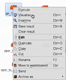
Task 1: Mean-sea-level pressure & wind gustRight-click the mouse button on the 'an_1x1.mv' icon and select the 'Visualise' menu item (see figure right) After a few seconds, this will generate a map showing two parameters: mean-sea-level pressure (MSLP) and 3hrly max wind-gust at 10m (wgust10). Use the play button You can use the 'Speed' menu to change the animation speed (each frame is every 3 hours). Task 2: Geographical regionRight-click the mouse button on the 'an_1x1.mv' icon and select the 'Edit' menu item (see figure right). An edit window appears that shows a number of lines of 'Metview macro' code. During these exercises you can change some of these to alter the parameters and plot types.
Change, Animate the storm on this smaller geographical map. Task 3: Plot wind fieldsChange the fields plotted to include the wind arrows. Make sure you have the Edit window showing.
As above, click the play button and then animate the map that appears. You might also want to change the mapType back to 'mapType=1' to show the larger geographical area. Discuss the storm development and behaviour with your colleagues & team members.
That completes the first exercise. If time
If you prefer to see multiple plots per page rather than overlay them, please use the |


...
| Panel |
|---|
For this exercise, you will use the metview icons in the row labelled 'Oper forecast' as shown above. oper_rmse.mv : this plots the root-mean-square-error growth curves for the operational HRES forecast for the different lead times.
oper_to_an_runs.mv : this plots the same parameter from the different forecasts for the same verifying time. Use this to understand how the forecasts differed, particularly for the later forecasts closer to the event. oper_to_an_diff.mv : this plots a single parameter as a difference between the operational HIRES forecast and the ECMWF analysis. Use this to understand the forecast errors from the different lead times.
Parameters & map appearance. These macros have the same choice of parameters to plot and same choice of |
Key questions
| Notepanel | ||||||
|---|---|---|---|---|---|---|
| ||||||
|
Getting started
| Note | ||||
|---|---|---|---|---|
| ||||
Each team should look at the forecast from all 4 starting dates and each team member should see the RMSE curves. Start by looking at the RMS error curves for the 4 different starting dates using MSLP (mean-sea-level pressure) and wind parameters (wind gust at 10m: WGUST10 and wind-speed at 850hPa : SPEED850) and the two geographical regions. Use the As a team, discuss what plots & parameters to use to address the questions above given what you see in the error growth curves. Then look at the difference between forecast and analysis to understand the error in the forecast, particularly the starting formation and final error. Team members can look at particular dates and choose particular variables for team discussion. |
...