...
Exercise 1. Visualise the ECMWF analysis of the St Jude storm
Handout
See map of observations of wind-gust during the storm and the timeseries of maximum gusts.
| Note |
|---|
|
- Examine the map of wind-gust observations in the handout.
Note the observed area of strongest windgusts and their intensity. - How does the analyses compare with the observations?
- Understand the storm development and behaviour from the ECMWF analyses.
|
...
| Note |
|---|
| icon | false |
|---|
| title | Getting started |
|---|
|
| Section |
|---|
| Column |
|---|
Right-click the mouse button on the 'an_1x1.mv' icon and select the 'Visualise' menu item: |
| Column |
|---|
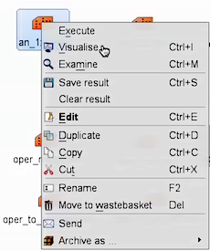 Image Added Image Added
|
|
- Start with
an_1x1.mv with mapType=1 to see the large scale.
Everyone should plot the mean-sea-level-pressure (mslp) and 10m wind-gust, over each 3hr period, (wgust10) plots. Remember you can overlay two or more variables as shown above and use animation. - Each team member can then choose their own parameters; look at the fields on different pressure levels; use the smaller geographical area (mapType=0) to compare with the observations.
- Discuss the storm characteristics and development.
If you prefer to see multiple plots per page rather than overlay them, please use the an_2x2.mv macro. |
...